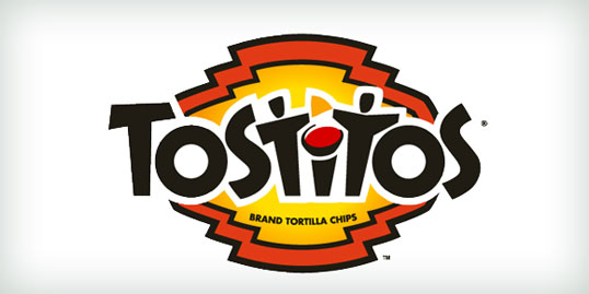
Design Festival just posted a really nice piece about 20 logos that use clever design techniques to take a concept from good to great. Check out the link below and see if you’ve noticed the cleverness in each. The Tostitos logo was the most surprising of all for me. Do you see the two partygoers snacking on the salsa? Love it!
